
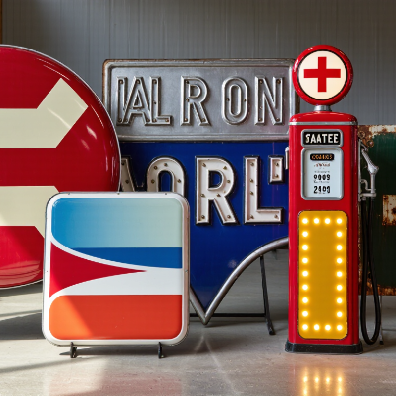
Retro gas pump signs began as practical identification tools, not decorative collectibles. Early examples used painted steel, porcelain enamel, and raised lettering. These materials resisted fuel splashes, rain, and strong sunlight. Their bold colors remained readable from moving vehicles. Small pump-top plates served local pricing and service information. Larger pole signs marked station entrances from a distance.
By the 1940s and 1950s, illuminated cabinet signs and neon became common. Embossed metal signs added shadows and depth, while porcelain panels created a cleaner, brighter appearance.
The National Association of Convenience Stores reported 152,255 U.S. convenience stores sold fuel in 2023. That scale helps explain why standardized pump graphics and tall roadside signs developed quickly.
Historical photographs remain useful, but they can mislead buyers. Repainted surfaces often look older than they are.
Authentic reproduction requires careful inspection.
Check mounting holes, rear brackets, enamel chips, letter spacing, and light-box ventilation. Original signs usually show uneven fading, small scratches, and oxidation near fasteners. Perfect aging may be artificial. That matters.
The Sign Research Foundation emphasizes visibility, contrast, and viewing distance in outdoor sign planning. Global buyers should also verify electrical ratings, corrosion protection, and local installation rules.
A retro sign can look convincing while failing practical safety checks. My field experience suggests simple construction often survives longer than decorative complexity. Still, historical accuracy should not excuse weak materials or unclear documentation.