
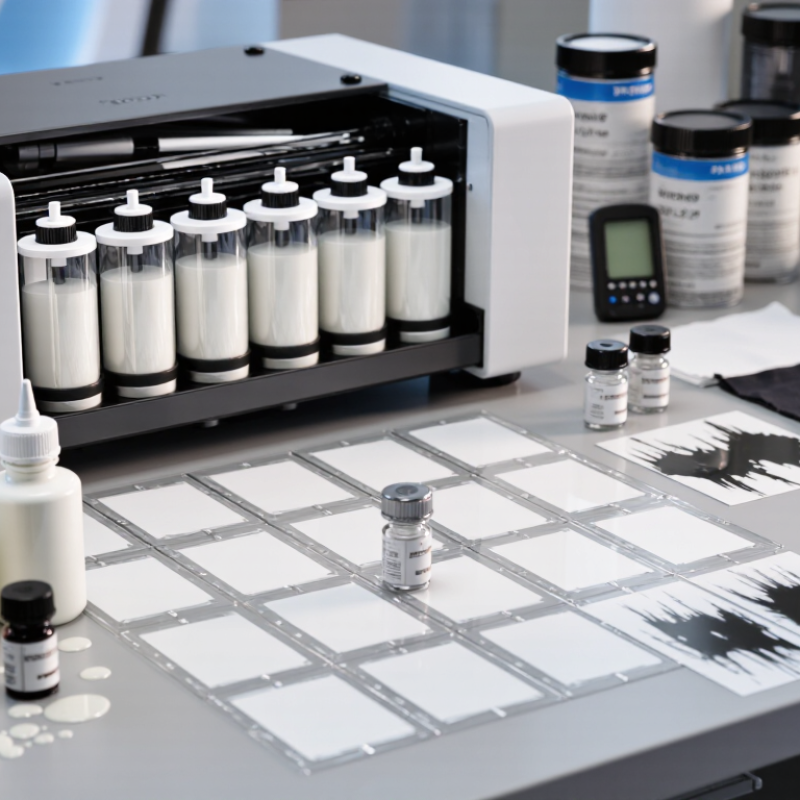
How to Choose the Best White DTF Ink in 2026?
When comparing white DTF ink, opacity should be tested on dark fabric, not only transparent film. A dense white base keeps colors bright and reduces gray edges. Print identical artwork with the same powder, film, printer settings, and curing temperature. Inspect the transfer under normal room light and direct light. Backlighting can reveal thin areas that look acceptable at first.
Whiteness is different from opacity. Some ink appears blue-white, while another looks warmer or slightly yellow. Use a white reference card beside each sample. If available, measure L*a*b* values with a calibrated device. Otherwise, photograph samples under fixed lighting. Human vision changes easily. Small differences become obvious beside pure white fabric.
Print performance also matters. Check nozzle tests before production and observe white ink circulation during longer runs. Look for sediment, uneven coverage, pinholes, and slow drying. I once compared samples at different humidity levels, which made the results unreliable. That mistake changed my testing method. I now repeat each test on separate days and record room conditions. After curing, examine stretch resistance, surface feel, and wash durability. A slightly less bright ink may perform better if it prints consistently and avoids frequent cleaning. In practice, the best choice balances whiteness, opacity, stable flow, and dependable finished results.